
Design manual

We have some guidelines on how to make BankID buttons look correct on your own platforms. It would be great if you could take a moment to get familiar with them.

When you refer to BankID in your service, whether on the web or in an app, the language and appearance must meet our requirements.

Download: Logos for Bankid (.zip)

Call to action

In cases where you offer a call to action button, such as 'Log in' or 'Sign,' you must meet the following requirements:

  • In web applications, a button or anchor tag (<a> or <button>) should be used. This complies with the accessibility requirements for keyboard navigation or screen readers according to the WCAG 3.0 standard.
  • The button must have the correct purple color with white text. See below for styling details.
  • The button text must be one of the approved options listed below.

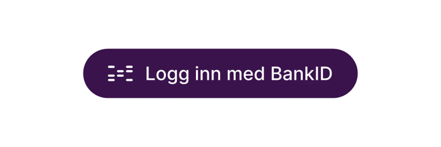
Example: Call to action button

Text should be one of the following

Norsk

English

Logg inn med BankID

Log in with BankID

Fortsett med BankID

Continue with BankID

Registrer med BankID

Register with BankID

Signer med BankID

Sign with BankID

Autentiser med BankID

Authenticate with BankID

Godkjenn med BankID

Approve with BankID

Styling

Color (light mode)

  • Background color (BankID purple): #39134C
  • Background color hover: #470D70
  • Text color: #FFFFFF

Color (dark mode)

  • Background color: #F6F6F9
  • Background color hover: #EFEEF3
  • Text color (BankID purple): #39134C

Height

  • Recommended: 48 px
  • Minimum: 48 px

Radius

  • Recommended: Rounded
  • Minimum: 6 px

Padding

  • Between logo/button textt og button left/right: 24 px
  • Between logo and button text: 14 px

Font

Font is Roboto, medium, 18 px.

Design - method selector

Text in buttons

Text in parantheses is a description of where the link leads.

BankID with app
(To BankID app).

BankID med code unit
(Entry for code units or OTP apps.)

BankID on mobile
(ITo BankID on mobile)

Placement

BankID on mobile is being phased out, and we want other methods to be more visually prominent. We also want end-users to recognize the BankID app button and choose it once they have downloaded the app. Therefore, we want the buttons to be placed in the following order, as shown below.

Vertical Placement

The buttons should be displayed in this order. The use of icons is optional. Here is an example of how to achieve vertical placement.

Example: Vertical placement of BankID buttons

Horizontal placement

The buttons should be displayed in this order. The use of icons is optional. Below is an example of how to achieve correct horizontal placement.

Example: Horizontal placement of BankID buttons

Icons

It is desirable, but not mandatory, to use icons on the entries. If icons are used, only the icons in this design manual should be used. Icons should not be used for BankID on mobile to place BankID on mobile lower in the hierarchy.

We prefer that icons with primary colors are used, but if they are placed on a dark background, negative icons can be used.

The icons are provided in two different sizes, small and normal.

In a design where the icon is displayed larger than 48 pixels in width, the normal size should be used. If the icon is to be displayed smaller than 48 pixels in width, the small icon should be used. We have made some small adjustments here to ensure that the details are displayed well. We do not recommend using the small icon in a size smaller than 32 pixels.

Under no circumstances should the icons be altered in terms of color or design.

Download: Icons for method selector (.zip)